This chapter encapsulated a ton of aspects that go into the legibility of type, many of which I don't think I've considered before. While I was reading this chapter, I thought back to some design projects I've done that have involved choosing and altering typefaces. I began to realize that the combination of all of the modifications defined in the textbook add up to your design looking 'just right', so to speak. While you as the designer may not be thinking of them individually, you are subconsciously tweaking your design to make sure that all of these properties are incorporated correctly.
I was also really intrigued by the section discussing the differences that occur when designing type digitally. This platform provides designers with so many more choices when making alterations, however, that comes with infinitely more challenges. The images that depicted gross distortion on page 60 reminded me of those optical illusions you often see on social media where if the user were to tilt their device they could read the text. In that context, the way type is formatted creates an engaging experience with the viewer.


The 'Typographic Details' section of this chapter provides a great comparison between good and bad typographic choices. This is definitely something I look forward to referencing for future projects. The tips concerning paragraph design are specifically helpful when it comes to making good impressions on job applications, resumes, etc. The hiring manager at my internship once told me that when hiring new employees this is something that actually makes a difference.

Ch. 4
While this chapter was a very visual one, it took a while to comb through all the images to understand what each one was trying to represent in terms of the typographic grid. Similar to my observation about the combination of specific choices in designing the type itself, I feel like in most cases, a novice designer might not be considering 'the grid' and all that it entails when making smart design decisions. These approaches are certainly important in good typographic design, however as the diagrams on page 70 depict, there are seemingly infinite ways to 'selectively' remove lines from a grid. It is almost certain that each and every design is unique in that there isn't just a handful of clever layouts that will work universally.

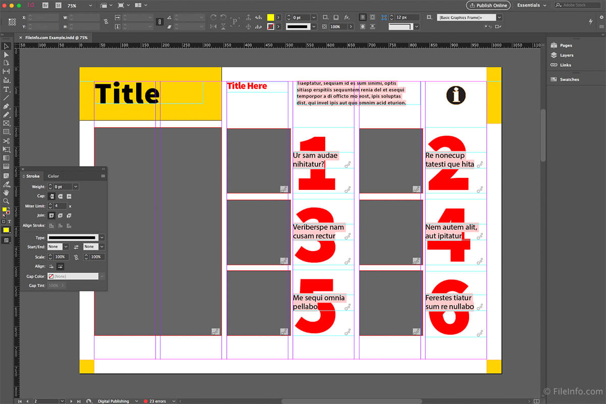
However, there are certain standards that exist in the word when it comes to layouts, specifically for print books (single-column), newspapers, magazines (multi-column), etc. More specialized layouts can be created using a modular grid, which again provides infinite possibilities for designing an organized layout. The images in the textbook reminded me of the tools available to designers such as Adobe InDesign or even Microsoft Publisher back in the day, both which make it easy to adjust gridlines and spreads.

The textbook starts to get a little meta when it shows images of a book of graphic design timelines, specifically because the first chapter of the text had a similar layout, and continues to use a unique combination of layouts in the following chapters. While it took some time to get used to this layout since I am reading it digitally, I slowly began to start appreciating the design choices being made in terms of the grid.
No comments:
Post a Comment