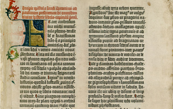
The first chapter tells the story through a timeline on how typography has evolved over generations. It begins with the invention of type, which was five thousand years ago. I was amazed to read that type was truly invented only five thousand years ago. The privileged knew how to write and their handwriting was known as the standard of what "type" was. But then finally someone came along and actually invented it, typography. It really does amaze me. Through the photos provided via the textbook, it’s interesting to see typefaces, such as, early gothic, be used in such religious locations. Traditionally, the term "goth" people connect it to the devil. But in the earlier times, almost every typeface was "name gothic". Type was the same for a long amount of time, it was thick and heavy. Until the Nineteenth Century and the Industrail Revolution, people needed strong type that would display their message clean cut and clear.
In the earlier times, everyone had to follow the guidelines. There was no freedom to experiment with typography. Until Millennium Began in the early 2000’s, this was the time to experiment. I have always had an appreciation for designs from the 2000’s. Without that era, we would not have evolved to what we are today.

Chapter 2
The chapter really captures my attention when it begins to describe the alphabet. It says, "Each letter signifies only one thing: it’s elementary sound or name." From there, it begins to describe how yes, our alphabet is only twenty-six letters, but with those letters we can write hundreds to thousands of words. I instantly gained more appericate for the simple ABC. From there, the chapter begins to describe how letters gain their shape. Due to tools being so limited in the earlier era, brushes reed pen, and stone engravers influenced the early forms of the alphabet.
As the chapter continues, it begins to describe how letters gain their shape for both lowercase and uppercase. How lowercase letters have 3 guidelines that they must stay within. Depending on weather or not the uppercase version touched the top line, then the lowercase would also touch the top line if it was a d or b for example. Letters have repeated objects, the crossing in an A would be repeated in the W or M, depending on the typeface.
For example, in the photo below. Pay attention to the e, and then look at the o. If the e were to be closed, it would be the exact same shape and size as the o. That is what I mean by repeated shapes in the typeface.
No comments:
Post a Comment