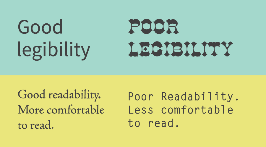
This chapter really opened my eyes to all of the many things that must be considered when using type. It seems to be so simple, but many designers pay such close attention to detail within the different typefaces, making sure each message is portrayed as visually appealing as possible. This has kind of helped to remind me that there are a lot more fundamentals to design that are often overlooked. One thing in particular that I found interesting was how making changes as small as changing the font from uppercase to lowercase, or changing the weight of the type, can do so much as change the distinctness of the word itself. Another important factor this chapter mentioned was the use of color. It seems that introducing color could complicate things, considering the endless possibilities they offer, but if the correct hue or contrast etc.is used it is possible to produce something very pleasing to the eye. Color can also be used to improve the legibility of a lot of typefaces because it has the ability to be combined, in order to find the perfect balance. It is also very interesting to play around with not only text color, but contrasting background and text color. This chapter also encouraged me to look at everything as a piece of art, or as something that elements of design were put into. For example, everything you read was put together in a particular way in an effort to have it portrayed in the correct way.
Chapter 4-The Typographic Grid
This chapter was very helpful in representing the different ways space can be used in order to depict a feeling through typography, for example just the placement of a letter on a blank piece of paper can change its velocity and emphasis. Before reading this chapter I believed that everything in design was made simply by trusting your eye, this can be true at times, but there is in fact a whole method of calculating where things will look best when they are placed together. There is a large amount of grids and use of other shapes that can be changed in order to display something in a way that is appealing to the eye, and draws the viewer in. I have never learned about these different types of grids, but it makes sense that a system of measurement has been created for this field of design. It is also very fascinating to see how the different ways that type can be displayed, also has an effect on what methods of structure should be used. For example, a whole different set of rules can be applied to type that is shown on screen, rather than type that will be shown in a book or on a sign.

No comments:
Post a Comment