The grid that is still currently used today, has been used since the earliest forms of typographic/ written forms. The first typographic book was Gutenberg's forty-two-line Bible. It's so memorizing to read that this grid system after the evolution and creation of hundreds of new typefaces, is still used today. It has no crazy background story from one person, it begin after many pioneer efforts from movements, such as Futurism, Dadaism, Constructivism, and de Stijl.

The image above is an example of the grid system used. As I continued to read the textbook, it talks about how structure and space are used in this template. The lines that have small spaces in between are how letters are created when it comes to a title. Each letter should, traditionally, fix within one square. More than one letter may fit, that is depending on its shape and the kerning.
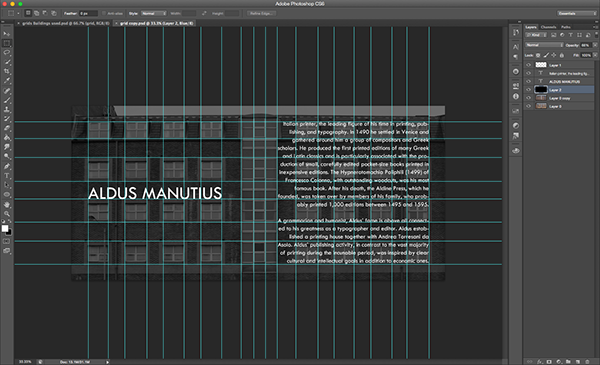

The natural division of the grid system is nothing more than a simple square. Simply due to the fact that squares can be adjusted to various different variations of itself. In the example image above, the square could take up 1/4 of an art board. Or it could be cut up into nine shapes, with the middle three being the tallest. But in the third, the squares are wider in their shape. Through this one shape, that can be stretched out via the width or length, and just through that the grid system can help any type work look clean and organized.
Chapter 5
Typography has a language of its own. It has a syntax that connects typographic sign to form words and sentences on the page. Letter, word, line, column, and margin are the elements of design.
 The letter comes in various weights, sizes and shapes. Through various typefaces, a letter can be transformed into much more than an N or a F. In the image above, we can see how the two letters are merged together in a beautiful serif type. The letters merged together this way work very well and is easy to read.
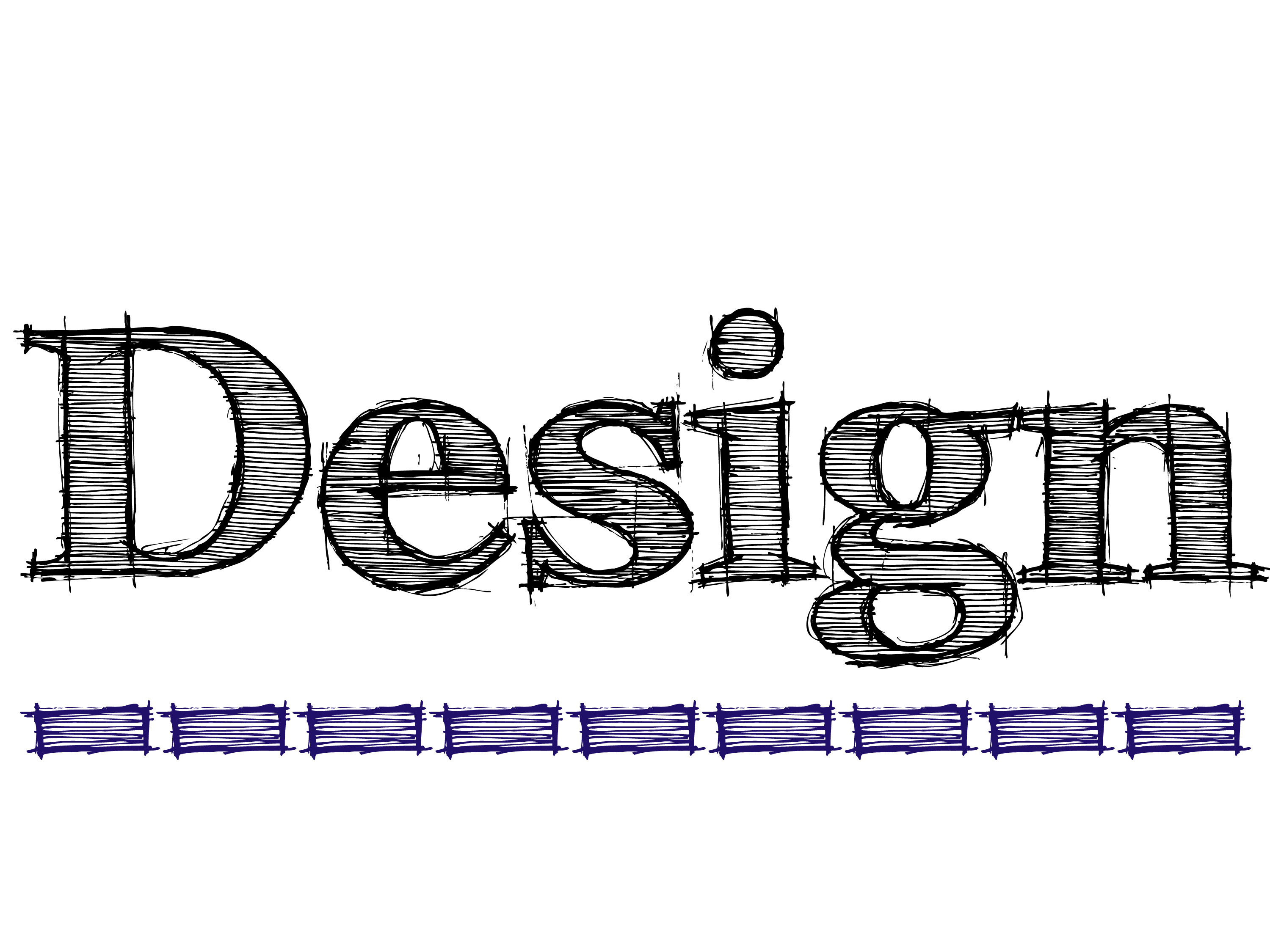 The word is expression of an idea, object, or an event. The textbook discusses how a single word can be one meaning attached to it, but the design can give it a hundred more meanings. I selected the image above because it says Design, but the way it looks and feels, it feels like it is being designed right in front of you. This is how the form and counterform relationship, that are also in individual letterforms, exist within individual words.
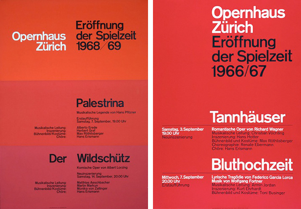
In the last chapter, it talked about the grid system and how it really influences the way typefaces are design. Lines, itself, have an impact on how layouts are designed with type. Especially when it comes to when it has to be read. In the states, we read from left to right. The way the words cut off at the end of the sentence, it has to be visually pleasing and understandable. In the image above, the first letter of every word meet. We may not see it, but there is a line straight line down in front of the words that guide the words to be aligned.
No comments:
Post a Comment