Here is an updated link to my Three Deadly Sins project: https://youtu.be/PyjWF7A6zys
Wednesday, October 31, 2018

Tuesday, October 30, 2018
News Recreation

Original Article: https://www.scientificamerican.com/article/redefining-the-kilogram/
Thursday, October 25, 2018


Recreating Nylon Magazine's Digital Article Layout

Link to original article: https://nylon.com/articles/film-award-predictions-2018
7 Deadly Sins Project Overview
Project Description:
Not to long ago I was on YouTube just watching random videos and I stumbled upon a video about how each of the characters from the Spongebob Squarepants TV show represents a different sin from the 7 deadly sins. So for my 7 deadly sins project, I have decided to create some posters for each of the characters showcasing the sin that they represent. I have not decided if I want to include a quote for each character. I have a different idea taking the same premise but in a different direction. I could do some type of playing/trading cards for each character instead of posters and their "power-ups" would be the sin that represents them.
3 Narratives:
1. Each one of the characters from the show are assigned a sin.
2. Each character is given a quote from the show that they have said.
3. The picture that each character has will showcase their sin.
4. The colors used will also indicate a sin..... (Maybe)
Seven Deadly Sins - Update
Inspiration on what each sin will look like.
Tutorial I am following: https://www.youtube.com/watch?v=zWSFGIEAz4s

"Everything in this room is edible"

Envy
""

Wrath
""

Lust
"what to come over?"

"i NEED my phone"

Pride
"i'm the king now."

Sloth
"Can't we just nap?"


7 Sins Update
My narrative is about the stages in an unhealthy relationship.

Starts off with sloth, then envy, greed, lust, gluttony, wrath, then ends with pride.
All the sins will be shown on different pieces of paper.
Sloth: To-Do list
Envy: Diary
Greed: Light-up mirror with lipstick type -or- regular lined paper
Lust: Tissue with a lipstick kiss
Gluttony: Coffee stained napkin and food crumbs
Wrath: Crinkled paper
Pride: Stationary - monogrammed note
Example (not finished) of Sloth:

Seven Deadly Sins Update (Envy)

For this week, I focused on creating a self-help book cover for greed. I have two different finished versions (see above). The only difference between the two is typeface; I couldn't decide which is better. Below, I included a screenshot of my workspace to show my process and other options that I ended up not going with.

7 Deadly Sins Update
Project Description:
A majority of candy brands use subliminal messages to promote their products, as a means to convince consumers that they will benefit from buying them. Candy is inherently unhealthy, so their ads have to be subtly manipulative to be successful. My project aims to expose this technique by reimagining candy packaging.
3 Narratives:
- Vectorized Candy Packaging -> tearing down the facade
- Sin = Candy Name -> summarizing the subliminal messages
- Tag-lines = Positive Space -> candy’s success is composed of manipulation
Anger (not complete)

Lust (complete)

Deadly Sins rough
For my deadly sins project I decided to look at Nintendo's Mario characters and attach one of the seven deadly sins to each one. The three naratives I will be focusing on are (1) the characters themselves, (2) "hacked" mobile ads and (3) interactivity of the ads.
My first attempt at this is Mario representing the sin of Pride.


My first attempt at this is Mario representing the sin of Pride.


7 Deadly Sins update
7 Deadly Sins Narrative
Thinking about the history of typography and the
introduction of the 7 Deadly Sins by Pope Gregory, I felt that both topics
share similar concepts. Although Pope Gregory’s 7 Deadly Sins were created in
the 6th century, these religious rules became influential in
Medieval Times becoming part of the social order and lifestyles – written about
by the monk’s in their typographic manuscripts.
I’m using Chess a game of the Middle Ages to represent the 7 Deadly
Sins. The Chess pieces represent the sins as the King-Pride, Queen-Envy,
Bishop-Greed, and Knight-Wrath: Pawn (Peasants)–Sloth, Rook (Castle)-Gluttony
and the Game Board (Board of Life)- Lust. However, these medieval characters and
sins are still apart of today’s wants and society. The chess pieces can be relatable
to people throughout history and people can choose to identify with those
characters.
To create the grid narratives, the chess board is the piece
that pulls all the characters together – it represents life, society and
lustful desires. As each character in
the game moves across the board they conquer their interests with the ultimate
goal of winning. As in life, if you are motivated by your sin, you will move
towards that goal. For example, a King is prideful and hungers for power; or Bishops
during the Middle Ages were wealthy and motivated by greed. Queens were envious of others positions and
wanted to be as strong as the King or to possess the most beauty. A Rook
represents the castle and all gluttony activity within. The Knights battled and
were filled with wrath. The Pawn represented the Peasants bound to servitude
and saw no way to climb the social order.
Surprisingly, they were seen as being filled with sloth because they had
no motivation in life. Today, people also possess these same desires,
motivations and social orders.


Seven Deadly Sins Update
Project description – a short experimental film that explores the influence of three of the seven deadly sins—pride, greed, and wrath—on the protagonist of the hit show Breaking Bad, Walter White, in his iconic “I am the one who knocks” speech.
3 Narrative Threads
- The through line will be the sound bite from his monologue
- Manipulation of video clips, opacity/blending modes, and various compositions to hint at the larger plot of the series and more importantly convey the specific sin being showcased in the sound bite
- Accompanying expressive type used to complement the tone, mood, and tempo of the lines heard verbally
This is a work in progress to get feedback before I fully commit to this project idea. My original idea evolved so much once I actually sat down and started playing around in Premiere. I spent a lot of my time this week really trying to narrow down my focus within this multimedia format. One of my top priorities for the final draft is to improve upon and add to the existing expressive text. One way I plan to do this is by adding more intentional motion and transitions to the type as well (e.g. the way the word “disappears” literally dissolves away with the clips towards the end of the work in progress).
Link to Work in Progress: https://youtu.be/UBWLVqTJXDs
Wednesday, October 24, 2018
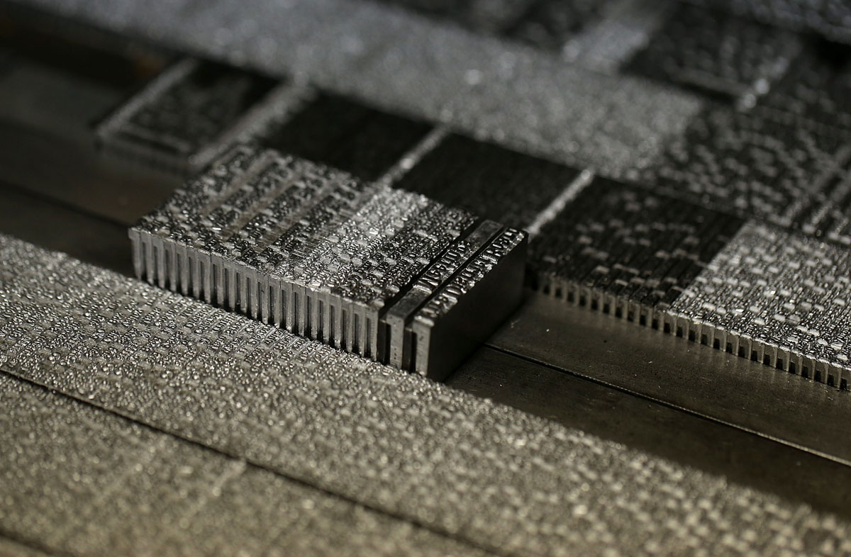
Chapter 7 Review
Chapter 7:
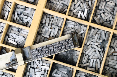
Within chapter 7 of our class textbook, Typographic Design: Form and Communication’s,
the primary topic of discussion is the evolution of typographic technology, from the very first
movable type machine to the awesome, pixel perfect type that we can create nowadays on digital
computers. This chapter goes into specifics for each technological typographic advancement.
My personal favorite would have to be the very first movable type machine. This is my favorite
because of the fact that it honestly reminds me a blacksmiths, in the sense that they both require
such patience, skill, and precision to accomplish. It really intrigues me how each and every letter
must be carefully placed on a Chase in order for it to create the desired type. I personally would
really love to see how this is done and if possible, try it out myself. It boggles my mind how exactly
it is that they make those tiny metal letters in the chosen font for the document being written.
This chapter goes on to briefly touch base on all typographic technological advancements that
have occurred throughout history and how each one paved the way for it’s successor. I believe
that we as a society have really come to appreciate the way that typography has evolved but I also
think that if we were to bring back some of the obsolete methods of creating typography, then
newcomers to the industry would be able to try those methods out and learn to appreciate them
as well. Typography is a living, breathing concept and science. I highly doubt that it is going to
disappear anytime soon. I am just very interested to see what exactly the next typographic
technological advancement will be and how it will affect our society.
Thursday, October 18, 2018
Chapter 7 Reflection
Chapter 7: The Evolution of Typographic Technology
This chapter was really fascinating for me because there is so much history behind this technology that I had no idea even existed. I have never seen or heard about phototypesetting, for example, and both versions seem so intuitive that I would love to experiment with modern versions. I found this image when doing some more research on this method, and it just looks so cool. This example shows a disk that contains multiple fonts with letters, numbers, and special symbols.

I think as designers we definitely have a tendency to take advantage of how easy we have it when it comes to customizing type, and even producing large amounts of text so quickly, whereas the process had been tedious and time-consuming not too long ago. The chapter mentioned how Adobe sort of kicked off this phenomenon of readily available fonts and the ability to alter them in a very streamlined and accessible way, and that has had such a ripple effect on how we interpret type.

Responsive design is also an underestimated aspect of design that is more relevant than ever with the volume of apps that are being released every day. The company that I intern for has a series of apps that are being altered and added to constantly, and one of the biggest challenges they face is making sure the apps look good on all devices. They even have a product testing table with just about every device you can think of to test out their apps.

7 Deadly Sins Moodboard
For the 7 Deadly Sins project, I wanted to create book covers satirizing various genres.
Gluttony: Cookbook
Lust: Romance
Pride: Autobiography
Greed: "Get Rich Quick" book
Envy: Self-Help book
Wrath: Tabloid cover
Sloth: fitness guide / "Dummies" book / Cliffnotes book


Chapter 7 Reflection
Chapter 7,
“The Evolution of Typographic Technology” introduces the invention of
typography as the “beginning of the Industrial Revolution”. With the invention
of the Linotype and Monotype machines in the 1880’s, typesetting became
automated moving away from the “tedious” task of hand composition, allowing
information to be shared quickly. Reading further along in the chapter several
connections came to mind. The printing press, invented by Johann Gutenberg in
1450, I recall claims as it being one of the most important human inventions. Spurring the Renaissance Period, the printing press helped to spread the ideas of the Enlightenment,
similar to the automated typesetting of the Industrial Revolution.


A further
connection comes from a book I discussed in a prior class entitled Orality and Literacy, by Walter J. Ong.
This book examines oral cultures that were dependent on their memories to
remember knowledge and their past due to the lack of a written language. To put this information to memory, knowledge was
repeated over and over again as well as using the same sayings or to store
information within stories. These sayings and stories became colorful, were
cherished and past down from generation to generation. It seems to me that even
before the start of literacy, 6,000 years ago according to Ong that cultures of
the past and present are not that different because information has always been
an important element to the human race. It does not surprise me then, that the
evolution of typography and the tools used to create it is a reoccurring
important aspect to the human culture. From detailed stories, monks who
tediously hand composed manuscripts, to perhaps working with dangerous molten
metals to create type casts, to the current digitally produced fonts they all seem
to share the common concept of designers developing innovative elements to relay information and attract attention. Therefore, I was surprised to read at the end of
Chapter 7 about the importance of designers having the “knowledge of the past, present and
future typesetting systems”(which were similar to my ideas) and that with this knowledge it gives designers the opportunity to blend elements
into new and interesting typographical displays.


Wednesday, October 17, 2018


Chapter 7
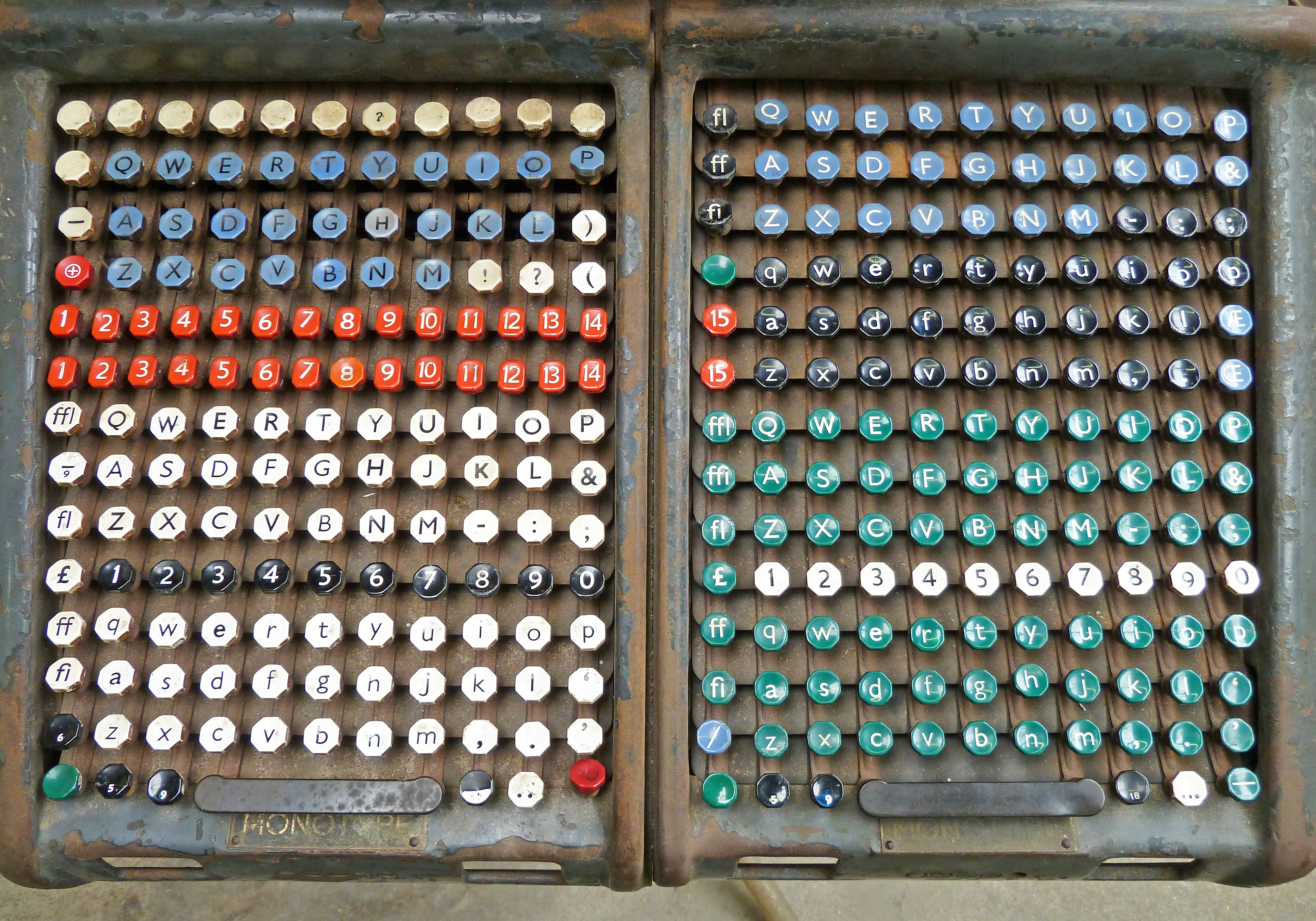
Chapter 7 was about typographic technology history from hand composition, machine composition, phototypesetting, digital typesetting and the screen-based typography. The only type of typographic technology I wasn't aware existed was the phototypesetting technology. It seems like fotoemulsion screen printing in a way, except it used light to directly print onto photo sensitive paper. After reading this chapter, I am certainly happy that computers existed because typography seemed like so much work back then. Kerning specifically would seem a lot of work. I don't particularly understand most of the machine composition as even thought reading it didn't really help visualize it in my mind. I think the best way to learn about these technology is just seeing a video of the machines doing their jobs, but I'm more of a visual and hands on learner. What I didn't see in this chapter was how technology improving probably helped growth of fonts as digitally it was quicker to make fonts and one didn't have to commit so much time to making "fun" fonts such as scripts. I also realize that the maintenance involved with the older technology must be so tedious to keep molds and printing blocks up to standards as having a letter not printing correctly could ruin the flow of the prints. I do want to try hand composition in an artistic glance.


Subscribe to:
Comments (Atom)